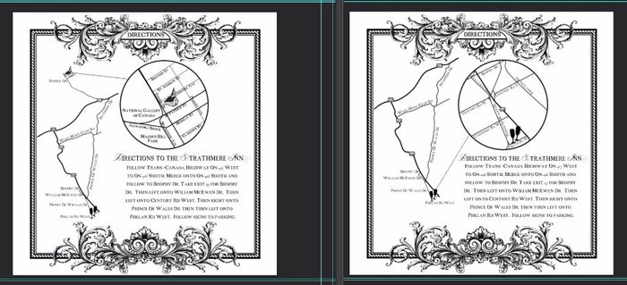
Hello everyone, I am in the process of designing my own letterpress invitations suite for my wedding and I am now at the "directions" cards part. I have 2 different cards, the one on the left is for the guests that are invited to the ceremony and the reception and the one on the right is for guests that are invited to the reception only. I would love to hear some feedback on my design, whether it looks professionally done (since I made everything myself and don't really want people to know lol) and what needs to be improved. I will also be providing a seperate information card with a link to our wedding website for detailed directions on how to get to the church. The actual size of the card is 5.5in X 5.5in. Thanks
