Post content has been hidden

To unblock this content, please click here

Lauren
Curious July 2021 Ontario

Wedding Invites/signage/stationary Dilemma

Lauren, on April 14, 2021 at 21:24 Posted in Plan a wedding 0 5

Hi Fellow Brides!

I hope someone can help because my FH is just not really getting my dilemma here.

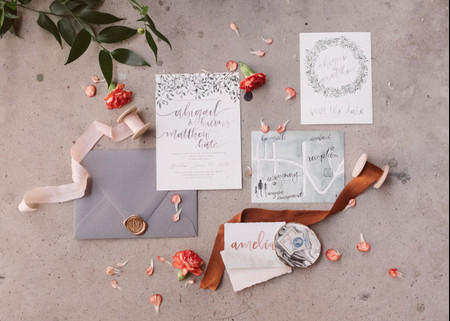
My plan for invites at this point is to just buy a template from Etsy and print them all out/cut them myself to save money.

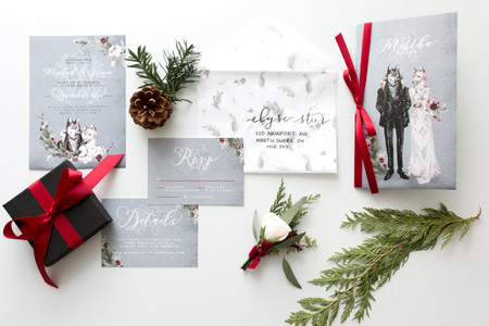
Most of them are in a large package that include signage such as seating charts, table numbers, welcome signs, etc. So it's all a cohesive look.

The invites we like are flowery. But then I'm feeling anxious because I picture a flower table number on our table, with our actual flowers and decor around them and I don't know if it will match, even if it DOES match, is that going to look too busy?

Basically, I'm worried that picking my stationery won't match my actual wedding and end up looking super busy or not match the rest of everything and I don't like that idea. I know I could have my signage look different I know that I could just have the signage at the wedding look different, but what's the point of spending all this time finding one design for invites that I love and then a completely different design for the signage at the actual event?

I know I'm probably overthinking this all but this is just how my brain works! How did you pick your stationary and signage? Is it all the same? Are you worried it will or won't go with your actual decor? Do you have any recommendations for good invite templates at an affordable price?

I hope this makes sense! I'm in a black hole of stationary and I think I'm starting to lose it.

Thanks in advance!

5 Comments

Latest activity by Lauren, on May 7, 2021 at 09:19
  • Lauren
    Curious July 2021 Ontario
    Lauren ·
    • Dispute
    • Hide content

    Thanks everyone for your help!! I appreciate all of the advice and I feel much better now about my choices.. Way less worried! I think I just need to relax and let go a bit! hahaha

    • Reply
  • Geneviève
    VIP September 2020 Ontario
    Geneviève ·
    • Dispute
    • Hide content
    If you were just planning on sending invites with digital RSVP, you could send one that doesn’t need to match RSVP or insert cards or signage. I know you can get the fill-in invites from Indigo that are cream and metallic coloured. They’d do the job while you decide what you want your aesthetic to look like.
    Or as another option: one thing we did was instead of table numbers, we did pictures of us in different places and named the tables after the locations in the pictures. We put the black and white pictures in frames that matched the palette that way a) no one got weird about the non-existent “table rank”, and b) we didn’t have to worry about how it tied in with our table arrangements. If you wanted to do table numbers, you could buy the plain cream numbers and put them in frames you like.
    • Reply
  • Vinod
    Top August 2017 Ontario
    Vinod ·
    • Dispute
    • Hide content
    The colours on the invite package can be your guide though the flowers can be different in that range. 2 different centerpieces alternating each table will give the look you want and not anyway out of colour palette. Use your pattern as the guide to your floral choices as table markers.
    • Reply
  • Amelia
    Master October 2020 New Brunswick
    Amelia ·
    • Dispute
    • Hide content
    If you're looking at Etsy, does the seller have a mix and match option? Are there invites you like from one package and decor signage from another (same seller) you think would be better together? If that's the case I would reach out to that seller and let them know how you feel and see if they can help out. Even mention that you're worried it will be busy and see if they can suggest something or create a different design. You might pay a little more, but in the end you'll be happier.
    • Reply
  • Hank
    Featured September 2021 Ontario
    Hank ·
    • Dispute
    • Hide content

    Your table numbers would only look busy if they're nestled right up against the flowers on the table, which they shouldn't since they should be at different levels in order for guests to be able to see the table number to find their seat.

    If it bugs you that much that your actual flower doesn't match the flower image on your table number (not that they need to match IMO), then either get flowers that match or get a stationary design with the flower you have in mind.

    Or just get the designs for the invites and seating charts but not the table number cards. You can use plain table numbers. They're easier to see for guests and plain doesn't take away from any aesthetics.

    • Reply

You voted for . Add a comment 👇

×

Related articles

Groups

WeddingWire Article Topics