Hi all! I'm designing our save the dates and I'm struggling with finalizing the design. I know I'm overworking it but I just want it to look awesome. Has anyone else struggled with making design decisions and have advise for moving forward?
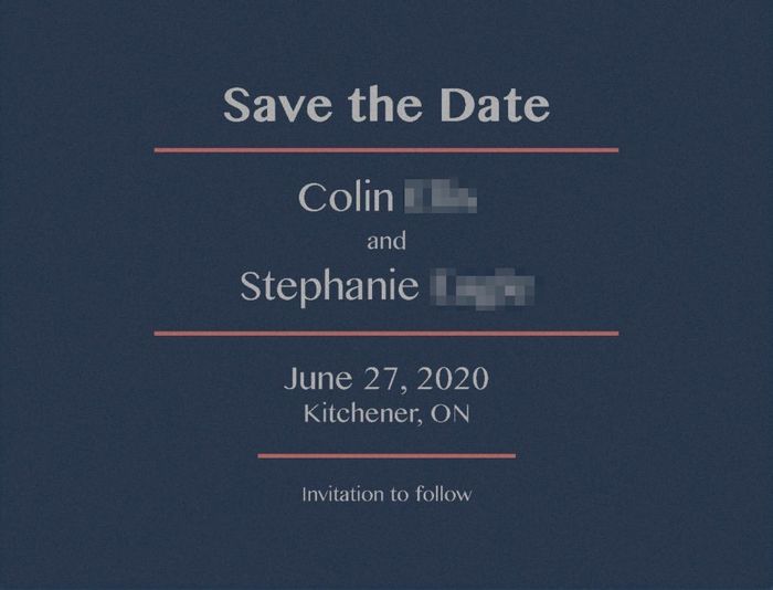
Also, what do people think of the below design? This is where I'm at right now. I was thinking about adding stars to the back but it might be too much. The design is based on vintage travel poster feel. My wedding theme is essentially nerdy vintage travel and our colour scheme is going to be dark blue and coral. The idea is that each table at our reception will be a different location in a fandom we love.
Save the Date - Front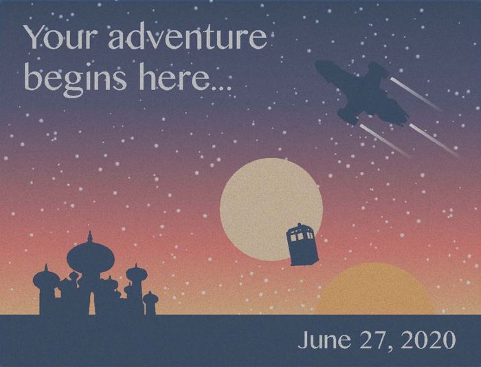 Save the Date - Back