
Post content has been hidden

To unblock this content, please click here

Valerie
VIP April 2017 Ontario

The place card conundrum 2 y'all!!!!!

Valerie, on January 9, 2017 at 09:29 Posted in DIY 0 26

Hey lovely ladies!

I once again need your collective wisdom to help me make menial and yet ridiculously important decisions!!!!!

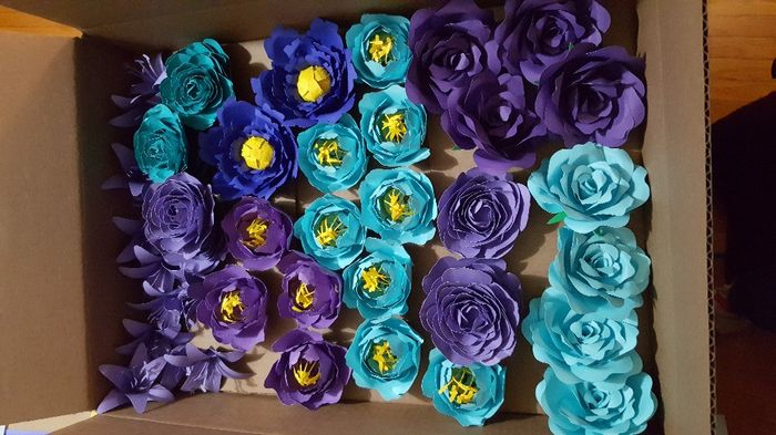
I have been diligently making a TON of flowers for my place cards (I think I'm up to about 40+ of 90), and they are turning out great!

Place Card Flowers Growing!

Place Card Flowers Growing!

BUT now I'm thinking about the actual card to put with them and I'm stuck... I can put either font onto either card of course, so let me know what card shape and font you like best.

Place Card Options

Place Card Options

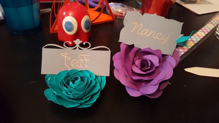
I think the purple "Nancy" font will be easier to read at a glance, I just love how different the blue "Jeff" font is. And I love the shape of the blue "Jeff" card, but I'm not sure if the simple cut of the purple "Nancy" card will be better...

Help me decide oh wise brides!!!!!

26 Comments

Latest activity by Vinod, on January 17, 2018 at 10:24
  • Vinod
    Top August 2017 Ontario
    Vinod ·
    • Dispute
    • Hide content
    The flowers look great and the card styles too. Great job on creativity.
    • Reply
  • Tina
    Devoted February 2018 Ontario
    Tina ·
    • Dispute
    • Hide content
    Like this one
    • Reply
  • Valerie
    VIP April 2017 Ontario
    Valerie ·
    • Dispute
    • Hide content

    Thanks Stephanielarson

    • Reply
  • Lisa
    VIP May 2018 Ontario
    Lisa ·
    • Dispute
    • Hide content
    Yes love the outline of the card! And the fonts!
    • Reply
  • Valerie
    VIP April 2017 Ontario
    Valerie ·
    • Dispute
    • Hide content

    I appreciate the honesty. I was going to have a bunch of different kinds of flowers.

    Do you like the outline on the card?

    • Reply
  • Stephanielarson
    Frequent user July 2017 British Columbia
    Stephanielarson ·
    • Dispute
    • Hide content
    I like the cut of the Jeff card. The other one is maybe to similar to the shape of the flowers. Both fonts are beautiful!
    • Reply
  • Lisa
    VIP May 2018 Ontario
    Lisa ·
    • Dispute
    • Hide content
    If I can be honest, I like the shape of the card in this pic! But I like the flowers in the first pics you posted better.
    • Reply
  • Valerie
    VIP April 2017 Ontario
    Valerie ·
    • Dispute
    • Hide content
    Ok made a new one... what do you think?

    The place card conundrum 2 y'all!!!!! - 1
    • Reply
  • Natasha
    VIP August 2017 Ontario
    Natasha ·
    • Dispute
    • Hide content

    Anytime Val, you have done an amazing job with these !

    • Reply
  • Valerie
    VIP April 2017 Ontario
    Valerie ·
    • Dispute
    • Hide content
    Thanks Em! Possibly... I think I would make myself crazy making sure they alternated if I did both so I wouldn't be able to make them until I decide the seating and I was hoping to make them earlier
    • Reply
  • Valerie
    VIP April 2017 Ontario
    Valerie ·
    • Dispute
    • Hide content
    Thanks Natasha!!
    • Reply
  • Valerie
    VIP April 2017 Ontario
    Valerie ·
    • Dispute
    • Hide content
    Haha hot reply on ye wrong one!!! Thanks LISA!!!***** Sorry about that
    • Reply
  • Valerie
    VIP April 2017 Ontario
    Valerie ·
    • Dispute
    • Hide content
    Thanks Natasha!!!
    • Reply
  • Lisa
    VIP May 2018 Ontario
    Lisa ·
    • Dispute
    • Hide content
    Valarie! They! Look! Great! I like the shape of the place card on the pink flower! And I like the gold, and the font. It's easier to read! I don't think the font has to be all matchy matchy. The font on the other card might be hard to read for some.
    • Reply
  • Emilie
    Featured Quebec
    Emilie ·
    • Dispute
    • Hide content

    Wooooow! I love them Valerie!! I even feel like both match together! Maybe you could use both? Smiley love

    • Reply
  • Natasha
    VIP August 2017 Ontario
    Natasha ·
    • Dispute
    • Hide content

    OMG i love them .... I love the Nancy font very elegant and easy to read! beautiful VAL !!!!Smiley heart

    • Reply
  • Valerie
    VIP April 2017 Ontario
    Valerie ·
    • Dispute
    • Hide content

    FH likes the font ans style of the Nancy card, but I like the others better. Though I do agree on the Nancy font, I do think it will be easier to read and the better choice.

    I think the card looking like a flower is why I like the other one more... more of a contrast. But I obviously like them both (I mean I made themSmiley laugh ), so I'm very conflicted!!!!

    • Reply
  • Samtam
    VIP November 2016 British Columbia
    Samtam ·
    • Dispute
    • Hide content

    I do like the Nancy font because it's pretty but still easy to read. I do agree though that the Jeff font looks like it would go well with your theme but might be a little difficult to read at times. What does FH think?

    I also prefer the card style of the Nancy card because the edges look similar to leaves or flower petals so I think it goes well. But the other one is nice too! Such tough choices!

    • Reply
  • Katherine
    Super September 2017 New Brunswick
    Katherine ·
    • Dispute
    • Hide content
    They both look great, I'm voting for Nancy because it is easier to read.
    • Reply
  • Brenda
    Expert April 2018 Ontario
    Brenda ·
    • Dispute
    • Hide content
    I would do the Jeff card and font then ...can't wait to see them finished Smiley smile
    • Reply
  • Valerie
    VIP April 2017 Ontario
    Valerie ·
    • Dispute
    • Hide content

    It's only an UO on here! HAHA, almost everyone else I asked agrees with you. I can make the "Jeff" card taller... do you think that would help? Also it may look like it's sitting higher because of the flower... maybe I'll take another pic with them sitting in the same type of flower, for a more even comparison

    • Reply
  • Valerie
    VIP April 2017 Ontario
    Valerie ·
    • Dispute
    • Hide content

    Thanks! Both cards are the exact same amount of work for me (almost nothing), so that's not really a factor. Thanks for the input

    • Reply
  • Valerie
    VIP April 2017 Ontario
    Valerie ·
    • Dispute
    • Hide content

    Oh I'll be changing the colour! When I do tests I like to use random paper colours so I don't waste the paper I actually need. I'll be printing them on white with purple or blue shimmer ink (haven't decided on the colour yet). Our guest list only has about 3 older guests (since most of our grandparents have passed away on both sides), so I'm not TOO worried about that.

    • Reply
  • Melissa
    VIP June 2017 Ontario
    Melissa ·
    • Dispute
    • Hide content

    UO: I like the Nancy font best, and the Nancy shape better. I think the Font looks alittle pretty/formal, and the card shape makes it look higher or something and easier to spot? I dunno, but thats my vote!

    • Reply
  • Brenda
    Expert April 2018 Ontario
    Brenda ·
    • Dispute
    • Hide content
    I love the Jeff it's a beautiful font but if older people are at your wedding you'll want them to be able to read the names. Some may some may not. The Jeff card is stunning and if it's light enough the gold should shimmer nicely.
    • Reply
  • Chelsea
    Master August 2017 Ontario
    Chelsea ·
    • Dispute
    • Hide content

    I think based off of other projects you are doing, your wedding will be very fun and I think that the "Jeff" card and font would fit in perfectly! Plus I also have noticed you love DIY projects and you like a challenge and so I would say go for the "jeff" ones! But whichever one you decide they will both look great!

    • Reply

You voted for . Add a comment 👇

×

Related articles

Groups

WeddingWire Article Topics