
Post content has been hidden

To unblock this content, please click here

Emily
Expert September 2020 Ontario

Invite pocket mock up

Emily, on March 2, 2020 at 13:50 Posted in DIY 0 6
I have gone the path of making my own invitations thanks to my lovely (and overworked) Cricut. This is a mock up I made of scrap paper. The real will be all gold card stock except the hexagon on the front which will be white (same white as the actual invites & detail cards).


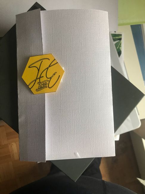
2 things!Can you read the hexagon? Any suggestions on good glue for putting it together or should I go double sided tape route?! I used regular tape for this but obviously that’s not presentable lol 😆
Thanks in advance! Pics below


Invite pocket mock up 1


Invite pocket mock up 2

6 Comments

Latest activity by Ashley, on March 6, 2020 at 14:44
  • Ashley
    VIP August 2020 Ontario
    Ashley ·
    • Dispute
    • Hide content

    I cant really read the hexagon lol!!

    • Reply
  • Tori
    Top October 2019 Manitoba
    Tori ·
    • Dispute
    • Hide content
    View quoted message

    It could also just be that I'm not used to seeing J's written that way? Because the fact that it's double lined has no part in why it's hard for me to read it - it's just because the top part of the J is so horizontally long and both loops are small. Again, just might be what I'm used to/ what I learnt in school for cursive. If it matches all of your other wedding signage I would just leave it at that then Smiley smile

    • Reply
  • Emily
    Expert September 2020 Ontario
    Emily ·
    • Dispute
    • Hide content
    View quoted message
    Hi Tori! You’re right on the letters - I may trying writing it a different way (right now it’s double lined/bubble letters instead of being solid) and see if that helps! It’s easy to read on the rest of my wedding signage and it would probably bother me to have one aspect a different font 😅
    • Reply
  • Emily
    Expert September 2020 Ontario
    Emily ·
    • Dispute
    • Hide content
    View quoted message
    Thanks for the input Amelia!! I’ll definitely try double sided tape. It is J & E, I’ll have to decided whether my love for it trumps ease of reading 😂😂 it’s the font that’s used through the entire wedding and I think it’s harder to read because of the double line (it wasn’t a draw font originally) - I may try printing them instead and see if it is more legible that way 🙏
    • Reply
  • Tori
    Top October 2019 Manitoba
    Tori ·
    • Dispute
    • Hide content

    1. I think it says J and E.... but I would go with a different font because it's super hard to read the J... even if it's in style I would still rather have my guests be able to read it over it be trendy (I think that's what Amelia was saying by "so hot right now").

    2. I wold use double sided tape as well.

    • Reply
  • Amelia
    Master October 2020 New Brunswick
    Amelia ·
    • Dispute
    • Hide content
    I would use double sided tape, it's less messy than glue so it should be less of a headache in the long run.


    Is it J and E? I had a bit of trouble reading it but I usually do with that swoopy don't that's so hot right now.
    I'm so excited to see how they turn out!
    • Reply

You voted for . Add a comment 👇

×

Related articles

Groups

WeddingWire Article Topics