Get the WeddingWire app
Complete your wedding team
Brides
Grooms
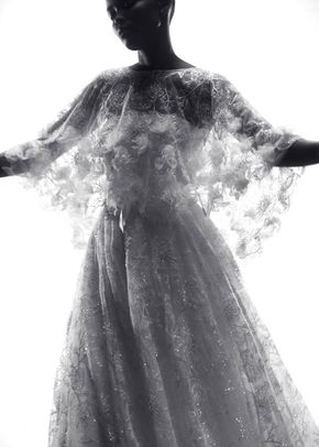
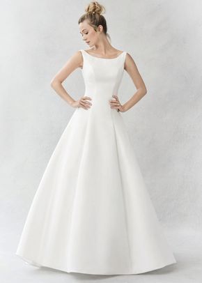
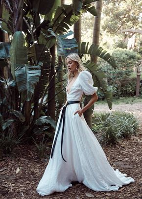
Wedding Dress Gallery
Featured designers
Find wedding inspiration that fits your style with photos from real couples.
View the latest
To unblock this content, please click here
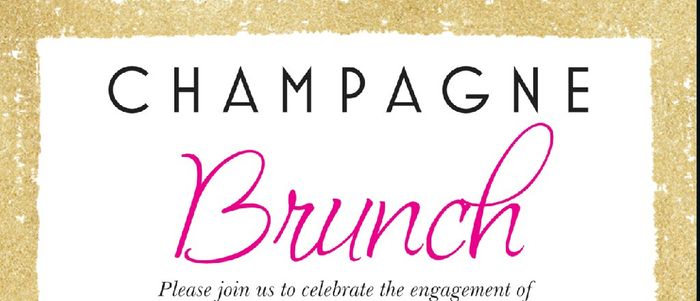
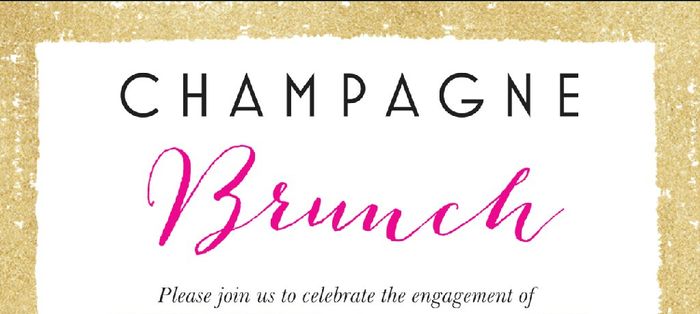
I prefer the first one, the second one might be hard for people to read for elderly.
I vote number one!! both are so nice though! love the gold
I vote number one !!! love it and love your colour choices lisa !!!
First of all I love the colours you picked! I prefer the first one!
I'm with you! I like #2! The font is more unique.
First one! I found the second one harder to read and had to reread it. Both are beautiful though
I'm in the minority too, I like the second one
I pick #1!
I think the first one matches better!! It's beautiful!
I think you mixed them up in our convo... cause I totally picked the same one
Love the first!!!
You voted for . Add a comment 👇
The characters written do not match the verification word. Try again.
Groups
WeddingWire Article Topics