
Post content has been hidden

To unblock this content, please click here

BunnyBride
Super August 2334 Nova Scotia

Feedback for Table Sign Design

BunnyBride, on March 13, 2020 at 16:26 Posted in DIY 0 6

Hi Everyone!
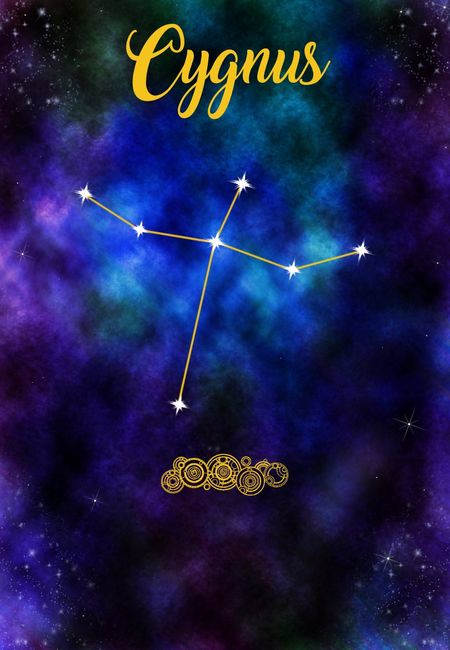
I was hoping to get some opinions/feedback on my table sign design. I think I have pretty much got it the way I want, but the artist in me is always "One more tweak"....lol...so not sure if it's the perfectionist artist voice or does really need something. I figured it'd be good to get outside opinions.

Any suggestions to try or do you think it is good to go? I am going to be doing a different constellation for every table, but Cygnus is the trial run as it is a fairly simple one.

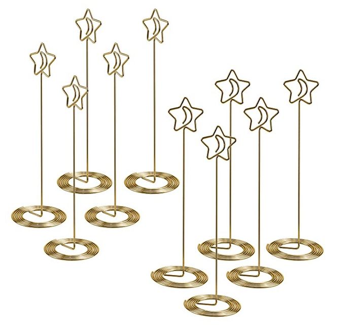
The bottom was purposely left "blank" because of the type of sign holders we are getting (picture below the design)

Feedback for Table Sign Design 1


Feedback for Table Sign Design 2


6 Comments

Latest activity by Ashley, on April 9, 2020 at 17:08
  • Ashley
    VIP August 2020 Ontario
    Ashley ·
    • Dispute
    • Hide content

    It looks nice however i would use a different font i found it a little hard to read until i read your post.

    • Reply
  • Vinod
    Top August 2017 Ontario
    Vinod ·
    • Dispute
    • Hide content
    Love your concept and the holder. We did the same though the menu card I created matched the Thank You card design put on a bell clip on a smaller scale. Nicely done on your idea.
    • Reply
  • BunnyBride
    Super August 2334 Nova Scotia
    BunnyBride ·
    • Dispute
    • Hide content
    View quoted message

    Feel free to steal the idea if you want or don't already have your table signs done. Smiley winking

    I think you and Laura are right. I have been playing around with some other less cursive fonts like Lucida Handwriting/Lucida Calligraphy or Blessed Day...and it does look a bit better and easier to read! It's competing a little less for the eye's attention with the constellation too.

    Thank you all for the feedback! Smiley laugh

    • Reply
  • Laura
    Devoted June 2022 Ontario
    Laura ·
    • Dispute
    • Hide content

    I love this idea!! I really like the idea of naming tables, and having it based on star names or constellations. I agree that the script is a bit difficult to read, but if matching it with escort cards, I think everyone will understand.

    • Reply
  • Amelia
    Master October 2020 New Brunswick
    Amelia ·
    • Dispute
    • Hide content
    This looks awesome! Really great job.


    I've been debating if I want to add a little celestial flair to our wedding, but the romantic in me wants to stick with florals.
    • Reply
  • Emily
    Expert September 2020 Ontario
    Emily ·
    • Dispute
    • Hide content

    Hi there!! I absolutely LOVE this idea and so sad I didn’t think of it myself. Smiley surprise

    I did find the writing slightly difficult to read (mainly the C), I didn’t know what it said until I read your description. That being said, i think you’ll have this issue with a lot of fancy cursive fonts and it just depends on the person reading it - so I don’t think it’s a major deal but just wanted to mention it Smiley smile

    • Reply

You voted for . Add a comment 👇

×

Related articles

Groups

WeddingWire Article Topics